MCOM.
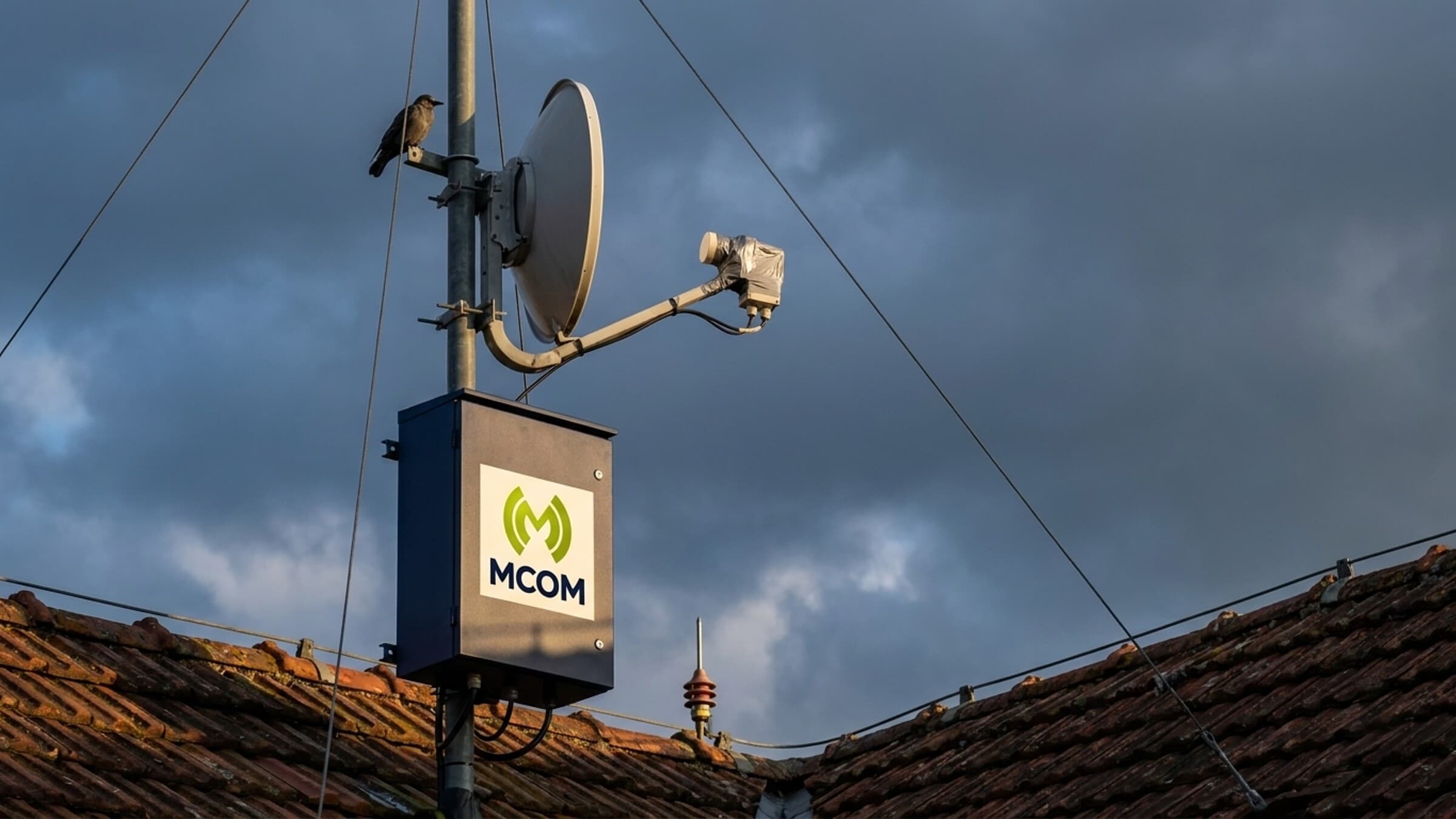
End-to-end brand identity for MCOM, a regional ISP – custom M monogram (signal-broadcast metaphor), lime-green + ivory system that survives from fiber-optic patch panel etch to billboard.
Roles
Logo Design Brand System Stationery Brand GuidelinesProblem
MCOM is a regional ISP – fiber-to-the-home, business connectivity, small-town infrastructure. They needed a brand mark and a system around it that could travel from a fiber-optic patch panel laser-etch to a business card to an embossed leather brand book to a roadside billboard without losing the same recognisable shape. The brief was short: monochrome system + one accent, no skeuomorphism, a mark that holds up at favicon size and at billboard size, and reads as "signal" the second you see it.
Approach
One mark, one accent. The M monogram is built from two overlapping
concentric shapes – readable both as the letter M and as a signal-broadcast
metaphor (MCOM = "M-com / communications"). Colour palette locked to
deep matte black + a single lime-yellow-green (#B0CE16 → #8AA306
radial gradient); wordmark in ivory cream (#F5F2EA), never pure white.
Type stack: one geometric sans for the wordmark + one workhorse sans for
body. Three-week engagement, end-to-end deliverable – including the
artwork specs for ISP hardware: rack-unit decals, fiber-connector
boot prints, ONT/router chassis etch.
Deliverables
- Logo system – primary mark, secondary horizontal lock-up, monogram variant, social avatar variant
- Type stack – geometric sans for wordmark + workhorse sans for body
- Hardware identity kit – rack-unit decal artwork (1U / 2U), fiber- optic LC connector boot prints, SFP+ transceiver micro-etch specs, ONT/gateway router chassis etch templates
- Stationery suite – business cards, letterhead, envelopes, leather notebook with blind-deboss M
- Brand guidelines book – colour, typography, spacing, do/don't, hardware applications, asset library
- Asset library – every artifact delivered as SVG + AI + PNG with approval-ready presets
Outcome
Brand shipped, live since 2022. The mark survives the full surface range – from a 4mm laser-etch on a fiber-optic LC connector boot, to a 24-port patch panel decal, to ONT-chassis silk-screen, to a 3m roadside billboard – without redesign. The leather brand book + business cards remain in client's daily kit; the hardware identity templates ship on every new install crate.
Pick
a week.
The one after,
we're building.

No slot fits? Send a brief →