[ 11 ]
OmniShop.
Multi-channel commerce showcase. Storefront, admin, analytics – built end-to-end as a frontend reference for prospects who want to see the pattern before they brief.
Why multi-channel, why this stack
Most growing commerce brands hit the same wall around their second year. They start on Shopify. They add Amazon for reach. They list a few SKUs on eBay because someone said they should. By the time a marketplace channel like Allegro or eMag enters the mix, they're switching between four dashboards, reconciling inventory in a spreadsheet, and noticing that conversion rates are completely different across channels but they don't have one place to compare them.
OmniShop is a reference build for that wall. It demonstrates the surface area a unified commerce ops platform needs to cover – without pretending to be a SaaS product I'm selling. The point isn't "here's a Shopify alternative." The point is here's how I'd architect the storefront-and-admin system if you walked into discovery with this problem.
Customer-facing surface
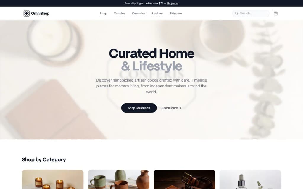
The storefront is the conversion side of the build. Light theme, generous whitespace, AI-generated product photography for visual consistency, a category-driven catalog of artisan goods (candles, ceramics, leather, skincare).
Gallery below walks the UI path: homepage → product detail → cart → checkout.
Brand identity

Same token spine as the UI: faceted mark, navy shelf, electric blue accent on digital. Shown here as physical + tablet – a deliberate pause before the dark ops surface.

Identity stays quiet so product UI stays the hero – colour discipline carries from print to screen.
Operator-facing surface
The dashboard is the ops side. Dark theme – not because dark mode is fashionable, because operators stare at it for eight hours a day and the storefront's white background would tire them. Channel-specific colours (Shopify green, Amazon orange, eBay red, Direct blue) keep multi-channel data parseable at a glance.
The overview is the "good morning" view: KPIs, revenue trend, channel mix, recent orders, top products. Analytics goes deeper: growth, acquisition cost, lifetime value, return rate – the numbers a commerce operator actually steers by – plus revenue-by-channel and category mix.
Stack & architectural decisions
Frontend       Next.js 14 (App Router) · TypeScript · React 18
Styling        Tailwind v4 · Radix UI primitives · custom design tokens
State          React Context (cart) · Zustand (app) · React Query (server)
Forms          React Hook Form + Zod
Charts         Recharts
Icons          Lucide (290+ icons)
Animations     Framer Motion + Tailwind keyframes
Build          Turborepo monorepo
Deploy         Vercel (Edge functions where they help)
Quality        ESLint · Prettier · Husky · Commitlint
Imagery        Seedream 4.5 (BytePlus) for product photography
1. App Router for the storefront, not Pages Router. Server components for category and product pages mean the SEO-critical surface ships server-rendered HTML. The cart and admin are client components where they need to be – checkout flow, dashboard interactions. Mixing render strategies inside a single Next.js app is routine now, but the decision still matters: a storefront that ships as a SPA loses organic traffic.
2. Three state libraries, not one. Cart state lives in React Context – small, session-scoped, no global store. App-wide UI state (sidebar, theme, profile shell) lives in Zustand – minimal API, no provider soup. Server state (catalog, orders, analytics fixtures) lives in React Query – caching, background refetch, optimistic updates where it pays off. Each tool is sized to its problem.
3. Dual theme as a product decision, not a toggle. The storefront and admin have different audiences and different time-on-page. A dark-mode toggle on the storefront would be a distraction. A light-mode admin would tire operators by lunch. Themes are scoped to context: customers always see light, operators always see dark. Tokens are shared; the resolved theme is hard-coded per surface.
What this demonstrates
For prospects evaluating commerce work, this build covers:
– Storefront craft. Hero, catalog, product detail, cart, checkout, and confirmation – the full conversion path.
– Admin craft. Multi-page dashboard, KPI cards, charts, tables, settings surfaces – the full operations path.
– Design system discipline. Dozens of reusable components, two themes from shared tokens, motion vocabulary, responsive down to 320px.
– Information architecture. Storefront and admin trees, sidebar navigation, breadcrumbs where they clarify hierarchy.
– Stack judgment. Multiple state layers used intentionally, server vs. client split where SEO and interactivity demand it, monorepo structure ready to grow.
The codebase is dummy-data only. If you brief me with a real commerce problem, I'd start from a Discovery Sprint to understand the domain – B2B vs B2C, single-channel vs multi-channel, headless vs platform, EU compliance – not by lifting this scaffold.
Storefront path → checkout. Then admin.
Category row, search, and free-shipping threshold lead the fold so shoppers orient fast; Seedream 4.5 keeps product shots consistent without a studio week.
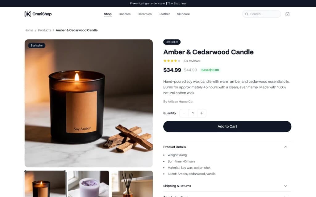
Gallery left and right stack surface price, rating, vendor, and quantity without scrolling; accordions hide care and shipping noise until expanded.
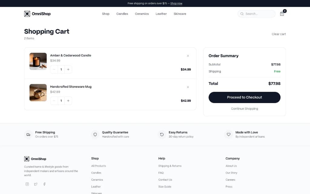
Splits line items from the summary so the checkout CTA stays visible when shoppers change quantities–especially on narrow breakpoints.
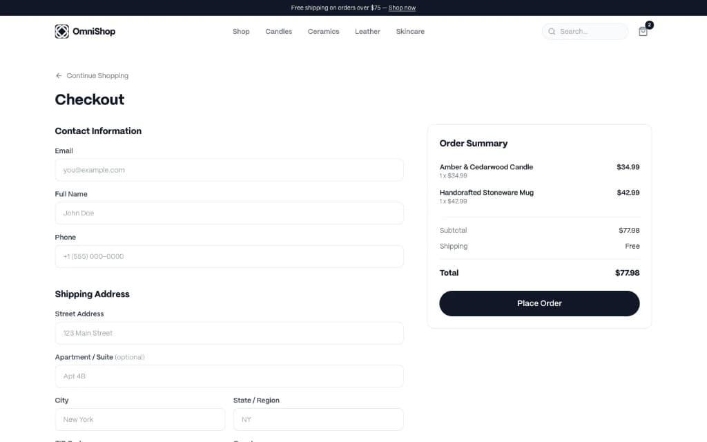
Single-page checkout runs contact, address, and payment in one scroll; summary stays pinned right with Continue shopping top-left for a cheap exit.
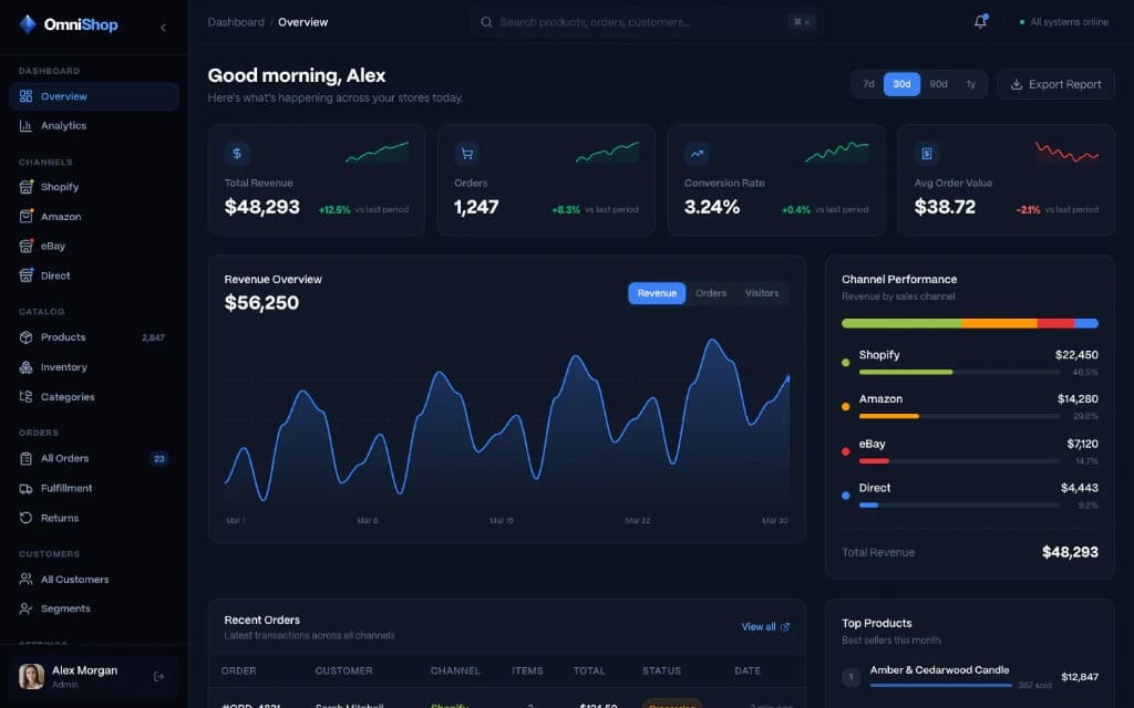
KPIs, sparklines, revenue trend, channel mix bar, recent orders, and top products land in one scan for a Monday-morning ops check-in.
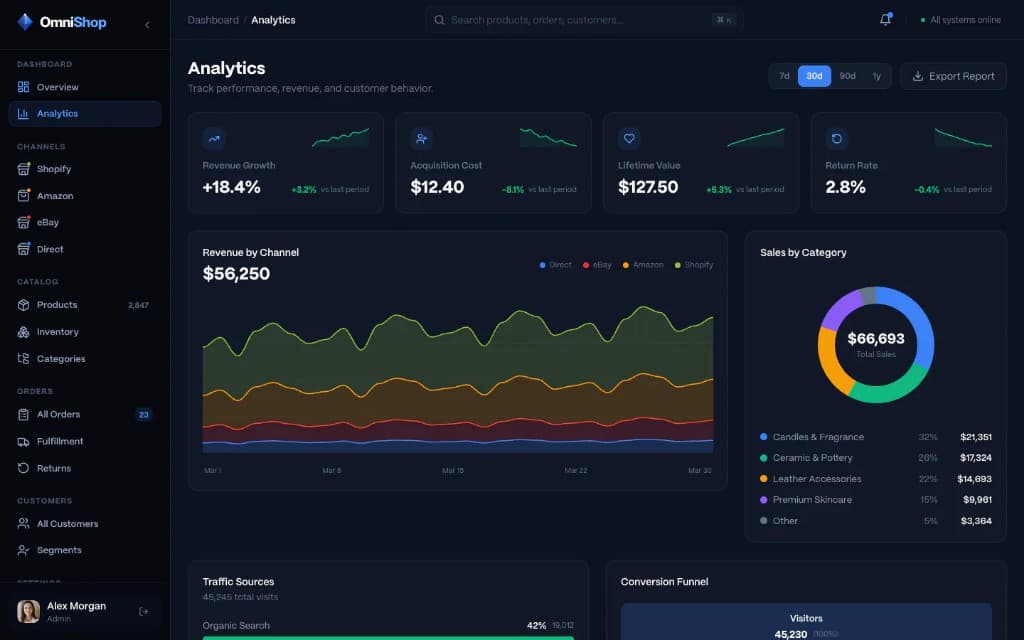
Adds steering metrics–growth, CAC, LTV, returns–and pairs them with revenue-by-channel, category mix, traffic, and funnel blocks.
Pick
a week.
The one after,
we're building.

No slot fits? Send a brief →